표와 그림을 통한 자료의 요약
범주형 자료의 요약
연습문제
3.1
# 라이브러리 불러오기
import matplotlib.pyplot as plt
import matplotlib.cm as cm
import matplotlib.colors as colors
import numpy as np
import pandas as pd
from paretochart import pareto
# 한글 입력
from matplotlib import font_manager, rc

font_name = font_manager.FontProperties(fname="C:/Windows/Fonts/malgun.ttf").get_name()
rc('font',family = font_name)
# retina 옵션으로 해상도 올리기
from IPython.display import set_matplotlib_formats

set_matplotlib_formats('retina')
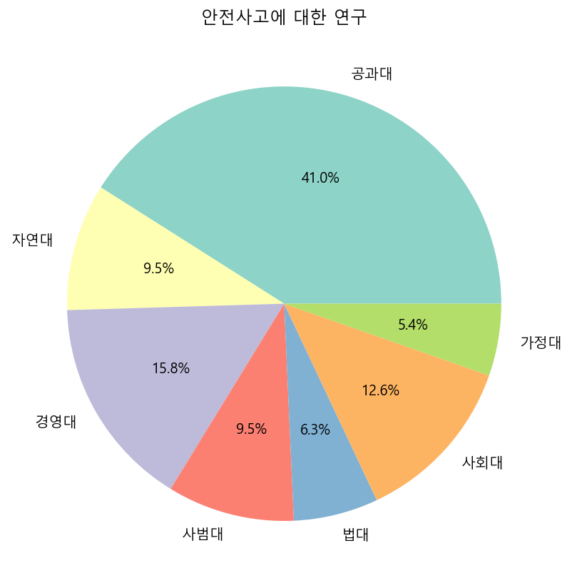
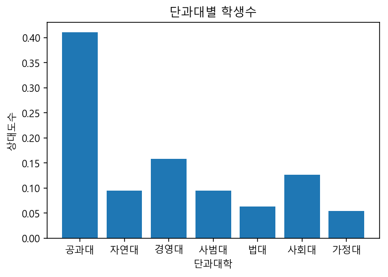
#input data
data = {'단과대학' : ["공과대", "자연대", "경영대", "사범대", "법대", "사회대", "가정대"],
        '학생수'   : [1300, 300, 500, 300, 200 , 400, 170],
        '학과수'   : [20, 6, 5, 6, 3, 8, 3]}
# pie chart
plt.figure(figsize = (7, 7))
plt.pie(data["학생수"], labels = data["단과대학"], autopct='%1.1f%%', colors = cm.Set3.colors)
plt.title("안전사고에 대한 연구")
plt.savefig('plot/연습문제3.1(1)_pie.png')
plt.show()
# bar plot
rf = data['학생수'] / np.sum(data['학생수'])
plt.figure()
plt.bar(data['단과대학'], rf)
plt.title("단과대별 학생수")
plt.xlabel("단과대학")
plt.ylabel("상대도수")
plt.savefig('plot/연습문제3.1(1)_bar.png')
plt.show()
# 3.1(4)
(data["학생수"][0] + data["학생수"][2]) / np.sum(data["학생수"]) * 100
56.782334384858046
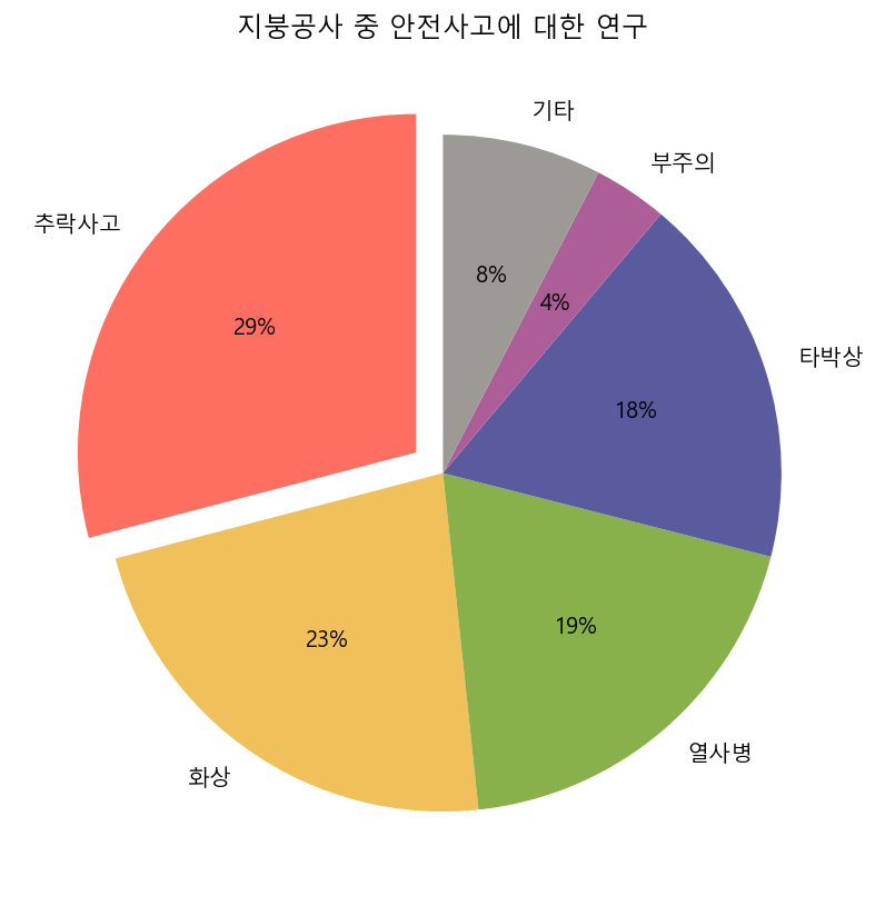
3.2
#input data
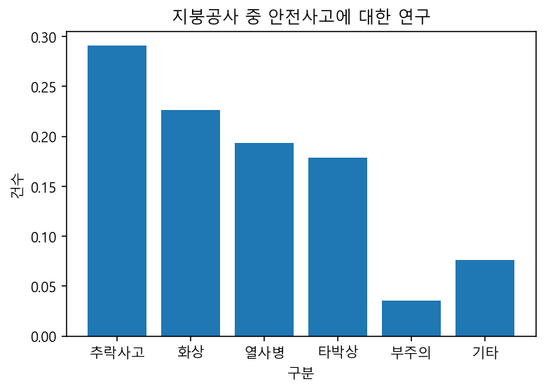
accident = {"구분" : ["추락사고", "화상", "열사병", "타박상", "부주의", "기타", "합계"],
"건수" : [329, 256, 219, 202, 40, 86, 1132]}
color1 = colors.hex2color("#ff6f61")
color2 = colors.hex2color("#f0c05a")
color3 = colors.hex2color("#88b04b")
color4 = colors.hex2color("#5a5b9f")
color5 = colors.hex2color("#ad5e99")
color6 = colors.hex2color("#9d9994")

palette = (color1, color2, color3, color4, color5, color6)
# pie chart
explode = (0.1, 0, 0, 0, 0, 0)

plt.figure(figsize = (7, 7))
plt.pie(accident["건수"][0:6], labels = accident["구분"][0:6], autopct='%1.0f%%',
        explode = explode, startangle = 90, colors = palette)
plt.title("지붕공사 중 안전사고에 대한 연구")
plt.savefig('plot/연습문제3.2_pie.png')
plt.show()
# bar plot
relative = np.divide(accident["건수"][0:6], accident["건수"][6])
plt.figure()
plt.bar(accident["구분"][0:6], relative)
plt.title("지붕공사 중 안전사고에 대한 연구")
plt.xlabel("구분")
plt.ylabel("건수")
plt.savefig('plot/연습문제3.2_bar.png')
plt.show()
3.3
#input data
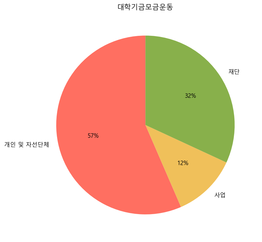
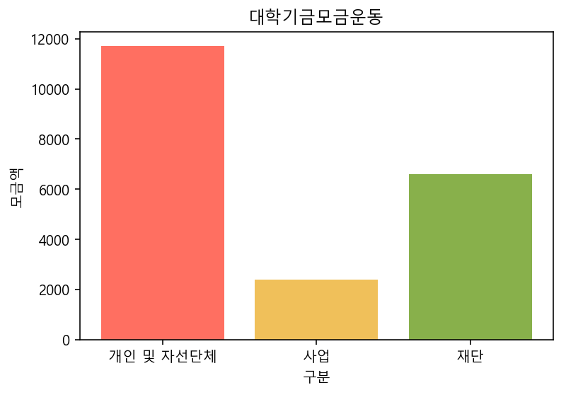
money = {'구분' : ["개인 및 자선단체", "사업", "재단", "합계"],
'모금액' : [11700, 2400, 6600, 20700]}
pd.DataFrame(money)
| 구분 | 모금액 | |
|---|---|---|
| 0 | 개인 및 자선단체 | 11700 |
| 1 | 사업 | 2400 |
| 2 | 재단 | 6600 |
| 3 | 합계 | 20700 |
# pie chart
plt.figure(figsize = (7, 7))
plt.pie(money["모금액"][0:3], labels = money["구분"][0:3], autopct='%1.0f%%',
        startangle = 90, colors = palette)
plt.title("대학기금모금운동")
plt.savefig('plot/연습문제3.3_pie.png')
plt.show()
# bar plot
plt.figure()
plt.bar(money["구분"][0:3], money["모금액"][0:3], color = palette)
plt.title("대학기금모금운동")
plt.xlabel("구분")
plt.ylabel("모금액")
plt.savefig('plot/연습문제3.3_bar.png')
plt.show()
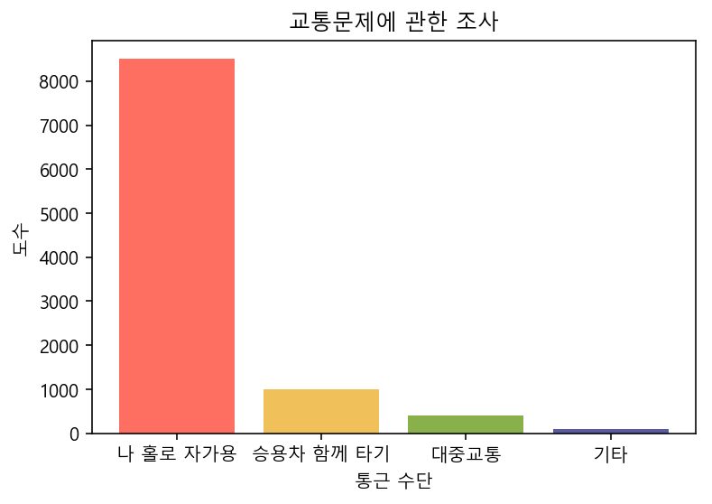
3.4
#input data
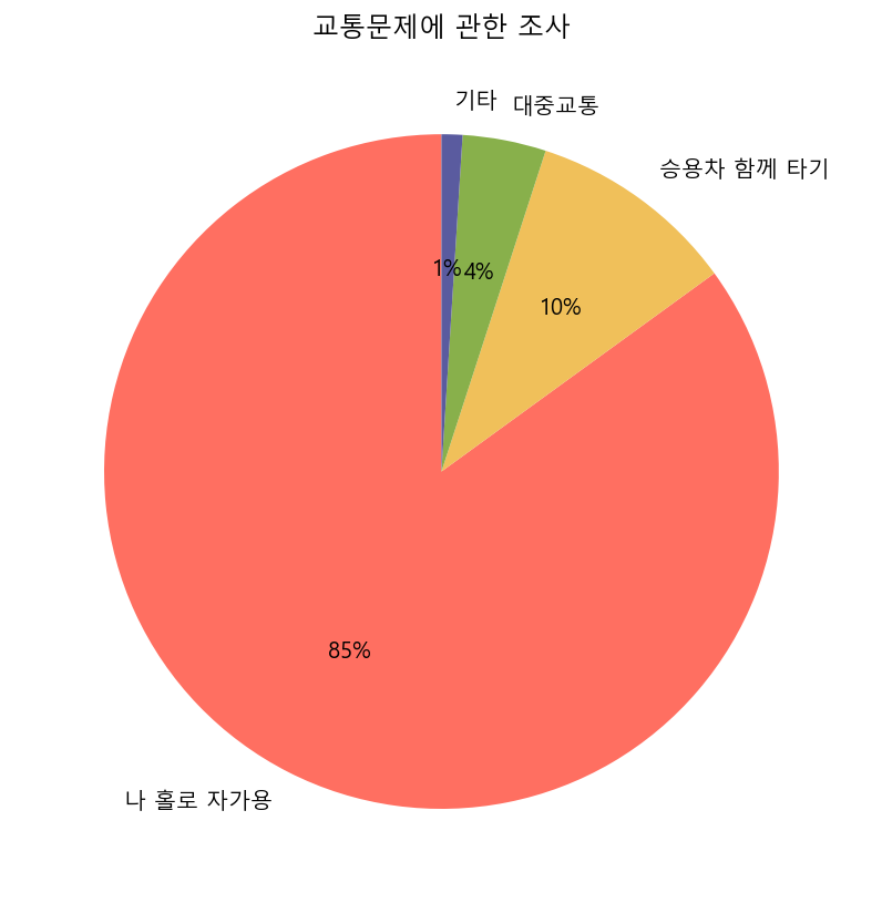
commute = {'통근 수단' : ["나 홀로 자가용", "승용차 함께 타기", "대중교통", "기타"],
'도수' : [8500, 1000, 400, 100]}
# pie chart
plt.figure(figsize = (7, 7))
plt.pie(commute["도수"], labels = commute["통근 수단"], autopct='%1.0f%%',
        startangle = 90, colors = palette)
plt.title("교통문제에 관한 조사")
plt.savefig('plot/연습문제3.4_pie.png')
plt.show()
# bar plot
plt.figure()
plt.bar(commute["통근 수단"], commute["도수"], color = palette)
plt.title("교통문제에 관한 조사")
plt.xlabel("통근 수단")
plt.ylabel("도수")
plt.savefig('plot/연습문제3.4_bar.png')
plt.show()
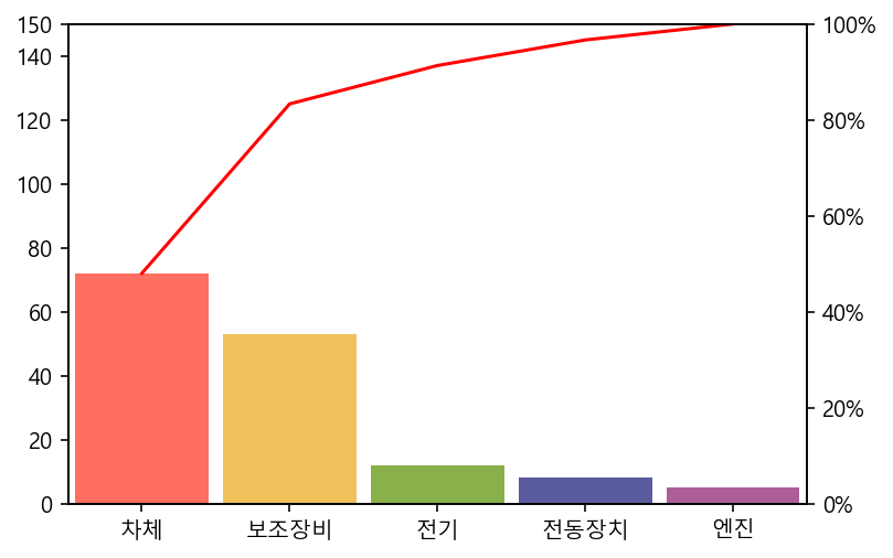
3.5
#input data
deficit = {'결함의 종류' : ["차체", "보조장비", "전기", "전동장치", "엔진"],
           '발생건수'    : [72, 53, 12, 8, 5]}
# pareto diagram
plt.figure()
pareto(deficit['발생건수'], line_args={'red'}, labels = deficit['결함의 종류'], data_kw = {'color': palette})
plt.savefig("plot/연습문제3.5_pareto.png")
plt.show()
이산형 자료의 요약
연습문제
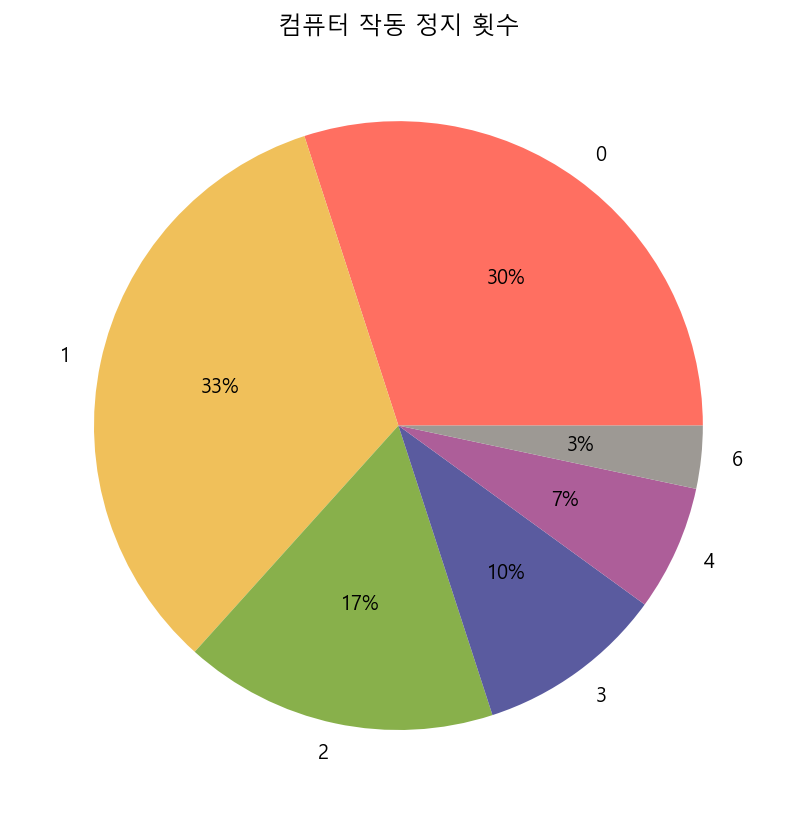
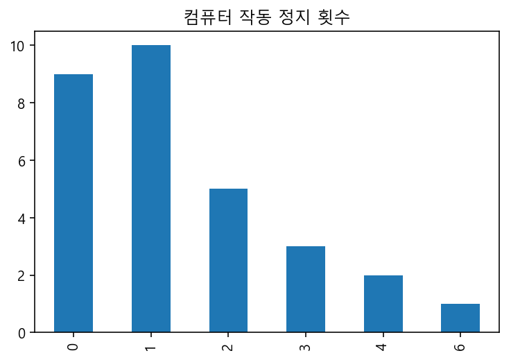
4.1
computer = np.array([1, 3, 1, 1, 0, 1, 0, 1, 1, 0,
                     2, 2, 0, 0, 0, 1, 2, 1, 2, 0,
                     0, 1, 6, 4, 3, 3, 1, 2, 4, 0])
# table
computer_df = pd.crosstab(index = computer, columns = "도수")
computer_df
| col_0 | 도수 |
|---|---|
| row_0 | |
| 0 | 9 |
| 1 | 10 |
| 2 | 5 |
| 3 | 3 |
| 4 | 2 |
| 6 | 1 |
# pie chart
computer_df.plot(kind = "pie", autopct = "%1.0f%%", subplots = True, legend = False, figsize = (7, 7), colors = palette)
plt.title("컴퓨터 작동 정지 횟수")
plt.ylabel("")
plt.savefig("plot/연습문제4.1_pie.png")
plt.show()
# bar plot
computer_df.plot(kind = "bar", legend = False)
plt.title("컴퓨터 작동 정지 횟수")
plt.xlabel("")
plt.savefig("plot/연습문제4.1_bar.png")
plt.show()
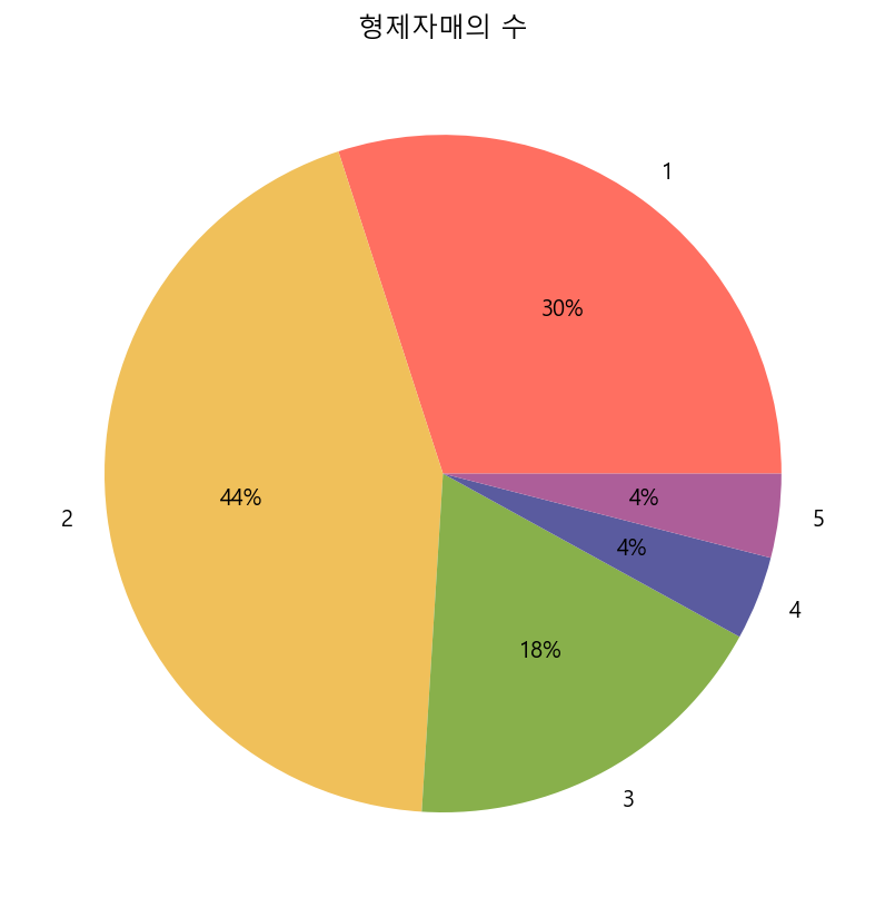
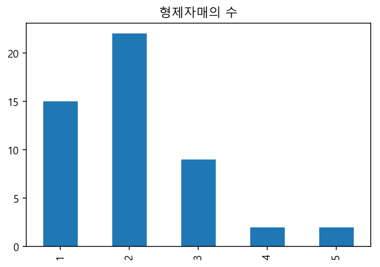
4.2
baby = np.array([1, 5, 2, 1, 3, 4, 2, 2, 1, 1,
                 3, 2, 3, 1, 4, 1, 1, 2, 5, 1,
                 2, 2, 2, 1, 2, 3, 2, 2, 2, 2,
                 2, 2, 3, 3, 2, 1, 2, 2, 2, 1,
                 1, 3, 1, 3, 3, 2, 1, 1, 2, 2])
# table
baby_df = pd.crosstab(index = baby, columns = "도수")
baby_df
| col_0 | 도수 |
|---|---|
| row_0 | |
| 1 | 15 |
| 2 | 22 |
| 3 | 9 |
| 4 | 2 |
| 5 | 2 |
# pie chart
baby_df.plot(kind = "pie", autopct = "%1.0f%%", subplots = True, legend = False, figsize = (7, 7), colors = palette)
plt.title("형제자매의 수")
plt.ylabel("")
plt.savefig("plot/연습문제4.2_pie.png")
plt.show()
# bar plot
baby_df.plot(kind = "bar", legend = False)
plt.title("형제자매의 수")
plt.xlabel("")
plt.savefig("plot/연습문제4.2_bar.png")
plt.show()
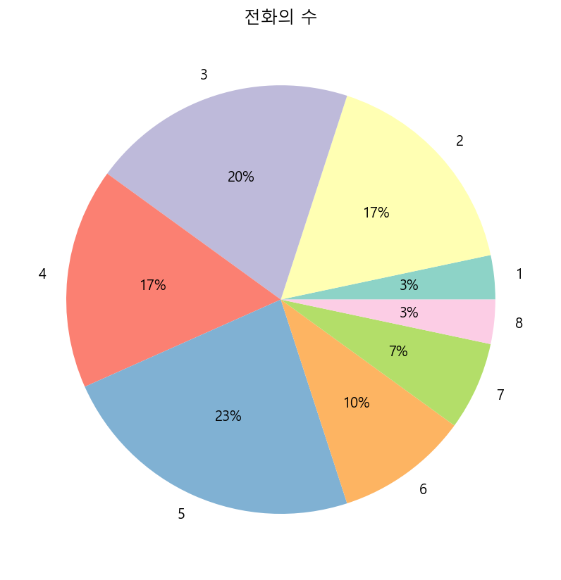
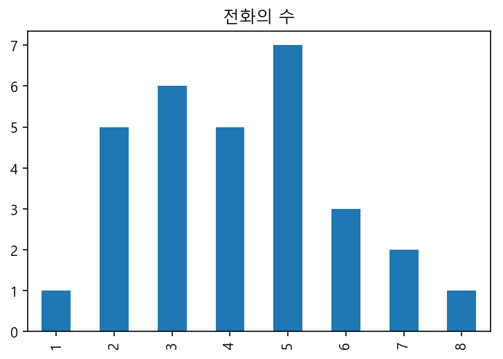
4.3
phone = np.array([5, 3, 2, 7, 3, 2, 6, 3, 2, 2,
                  5, 4, 8, 3, 5, 4, 4, 6, 2, 6,
                  5, 5, 5, 3, 4, 7, 1, 4, 5, 3])
# table
phone_df = pd.crosstab(index = phone, columns = "도수")
phone_df
| col_0 | 도수 |
|---|---|
| row_0 | |
| 1 | 1 |
| 2 | 5 |
| 3 | 6 |
| 4 | 5 |
| 5 | 7 |
| 6 | 3 |
| 7 | 2 |
| 8 | 1 |
# pie chart
phone_df.plot(kind = "pie", autopct = "%1.0f%%", subplots = True, legend = False, figsize = (7, 7), colors = cm.Set3.colors)
plt.title("전화의 수")
plt.ylabel("")
plt.savefig("plot/연습문제4.3_pie.png")
plt.show()
# bar plot
phone_df.plot(kind = "bar", legend = False)
plt.title("전화의 수")
plt.xlabel("")
plt.savefig("plot/연습문제4.3_bar.png")
plt.show()
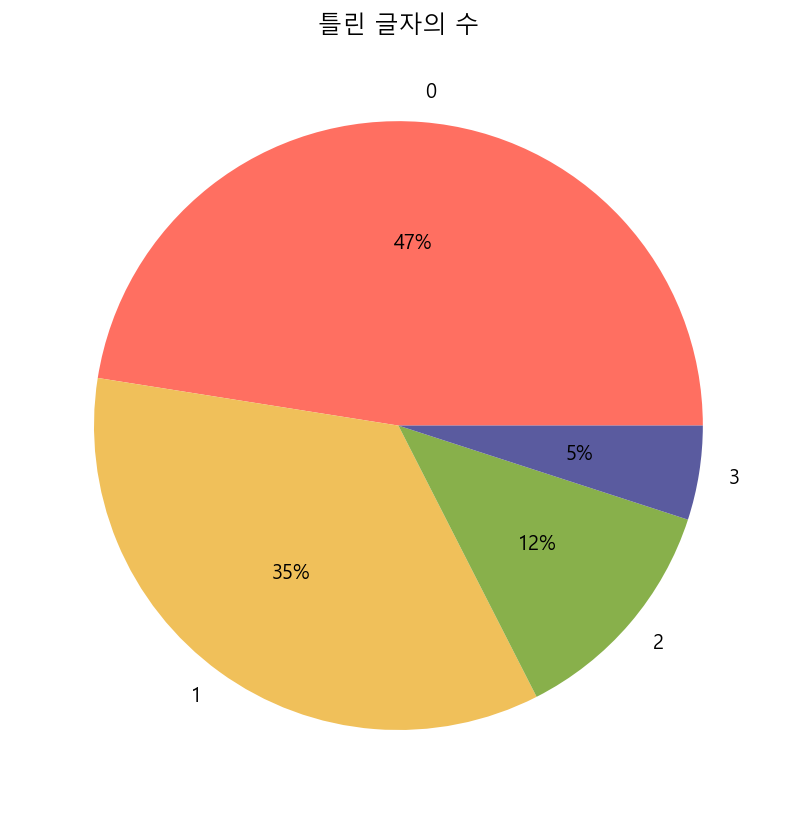
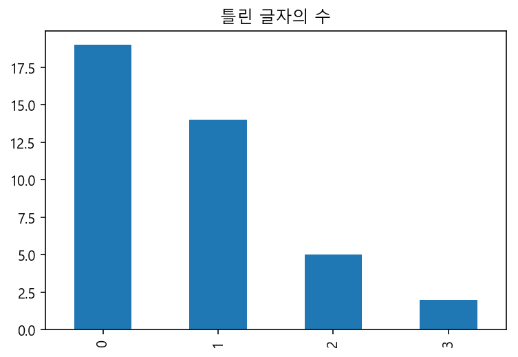
4.4
letter = np.array([0, 0, 1, 0, 0, 0, 0, 0, 1, 0,
                   0, 1, 0, 2, 3, 2, 1, 1, 0, 1,
                   0, 0, 0, 1, 0, 1, 0, 1, 2, 0,
                   2, 0, 0, 1, 1, 2, 1, 3, 1, 1])
# table
letter_df = pd.crosstab(index = letter, columns = "도수")
letter_df
| col_0 | 도수 |
|---|---|
| row_0 | |
| 0 | 19 |
| 1 | 14 |
| 2 | 5 |
| 3 | 2 |
# pie chart
letter_df.plot(kind = "pie", autopct = "%1.0f%%", subplots = True, legend = False, figsize = (7, 7), colors = palette)
plt.title("틀린 글자의 수")
plt.ylabel("")
plt.savefig("plot/연습문제4.4_pie.png")
plt.show()
# bar plot
letter_df.plot(kind = "bar", legend = False)
plt.title("틀린 글자의 수")
plt.xlabel("")
plt.savefig("plot/연습문제4.4_bar.png")
plt.show()
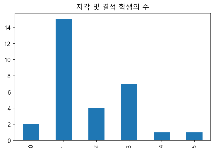
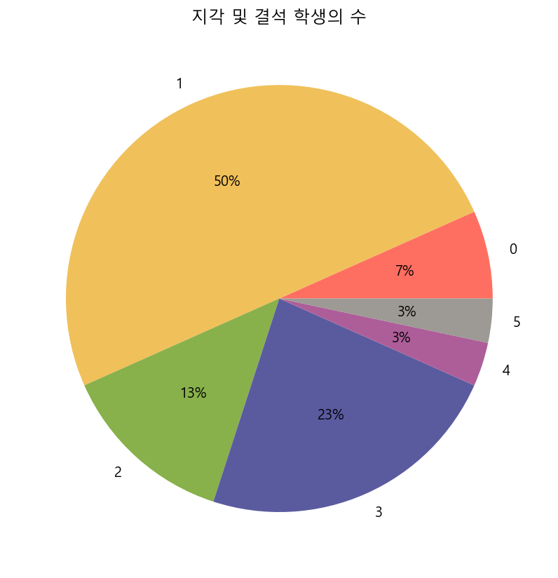
4.5
student = np.array([1, 3, 3, 1, 1, 3, 0, 3, 3, 3,
                    2, 1, 1, 1, 2, 4, 1, 1, 1, 1,
                    1, 2, 1, 3, 2, 1, 1, 0, 5, 1])
# table
student_df = pd.crosstab(index = student, columns = "도수")
student_df
| col_0 | 도수 |
|---|---|
| row_0 | |
| 0 | 2 |
| 1 | 15 |
| 2 | 4 |
| 3 | 7 |
| 4 | 1 |
| 5 | 1 |
# pie chart
student_df.plot(kind = "pie", autopct = "%1.0f%%", subplots = True, legend = False, figsize = (7, 7), colors = palette)
plt.title("지각 및 결석 학생의 수")
plt.ylabel("")
plt.savefig("plot/연습문제4.5_pie.png")
plt.show()
# bar plot
student_df.plot(kind = "bar", legend = False)
plt.title("지각 및 결석 학생의 수")
plt.xlabel("")
plt.savefig("plot/연습문제4.5_bar.png")
plt.show()